

Hawaiian Airlines hired User Kind to develop the user experience, design, and front-end development of their entire mobile facing website. Our work resulted in a 155% increase in mobile checkins, and a 55% increase in mobile bookings.

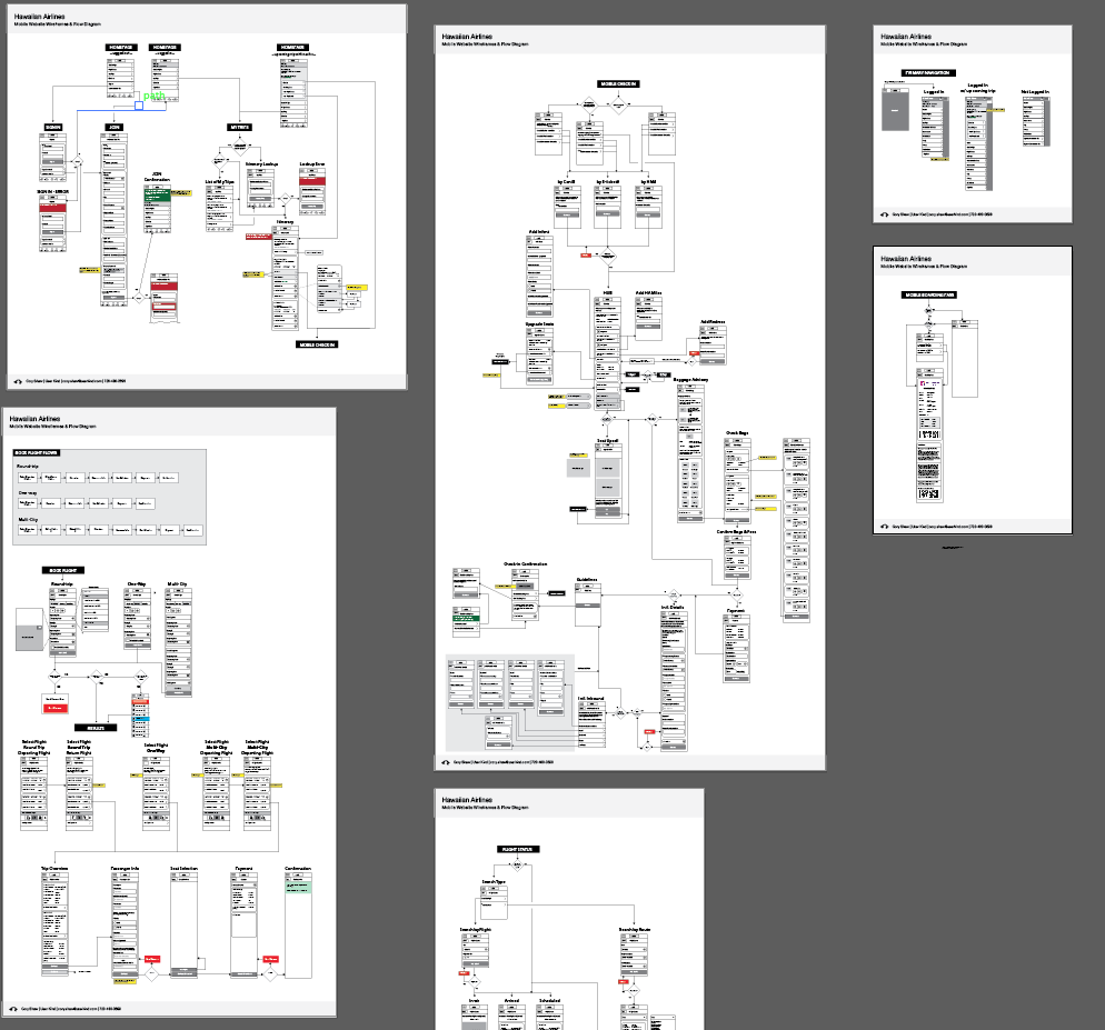
The first step was to layout a wireframe of every screen of the mobile site and figure out the best way users should flow between them.

My approach to wireframes on this project combined flow diagrams with the wireframes so that you can visually picture every screen in the system without fumbling through 100s of pages of a PDF.

As you can see this became a very large but necessary effort in ensuring that everything fit together properly before we got into design and code. This document was the driving force in ensuring that design and development went smoothly and efficiently.

One of the biggest challenges of this project was creating a seat selection UI that was easy to use on a mobile device. The result was a UI that scaled up or down depending on the airplane type to ensure that seat target areas were always as big as possible.

Boarding pass became a focus for getting you through security ant to your gate easily.

We provided a smart main menu that is accessible from anywhere on the mobile site. If you have an upcoming trip, the menu focuses on that trip.

The Flight Results design made selecting a flight and seat class a very simple process. More info on each result is available by expanding the top bar of the result.

The requirement for this project was to provide all of this in jQuery mobile, so we used jQuery Mobile elements to help inform the layout. In the end I built and delivered production-ready front-end code in the form of a clickable prototype that the back-end team was easily able to plug into the site.
